
Typography: The Art of Communicating Visually with Letters
- Dec 2, 2024
- 2 min read
Introduction
Initial Connection: Typography is in everything we read and see, from books to websites, from advertisements to logos. More than just fonts, it is an art that combines design, functionality and emotion.
Purpose of the Post: To explain what typography is, the different types that exist, its function in design and how it has developed over time.
1. What is Typography?
Definition: Typography is the study and application of the design of letters, numbers and symbols. It involves the choice, spacing and arrangement of fonts to convey messages effectively and aesthetically pleasing.
Origin of the Name: Derived from the Greek "typos" (form) and "graphia" (writing), reflecting its basis as a printing art.

2. What is Typography Used For?
Visual Communication: It facilitates the reading and understanding of text, creating hierarchies of information.
Expression of Identity: It helps to convey the personality of a brand or message through the style of the letters.
Aesthetic Impact: It improves the visual presentation of projects, making them more attractive and professional.
Practical Example: A wedding invitation uses delicate, cursive typography to evoke elegance, while a sports poster would use strong, dynamic fonts.
3. The Main Types of Typography
Serif:
Characteristics: They have "small strokes" at the ends of the letters.
Example: Times New Roman.
Use: Common in printed texts because they facilitate reading.

Sans Serif:
Characteristics: They do not have lines at the ends.
Example: Arial.
Use: Ideal for digital texts, thanks to their clean appearance.

Handwritten (Script):
Characteristics: Letters that imitate human handwriting.
Example: Brush Script.
Use: Invitations and projects that seek a personal or artistic touch.

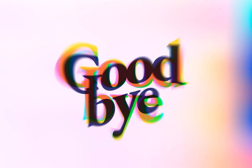
Display (Decorative):
Features: Flashy and unique styles, designed to make an impact.
Example: Comic Sans.
Use: Titles and highlights, but be careful not to overload.

4. How Typography Was Built
Beginnings in Printing: Johann Gutenberg developed the printing press with movable type in the 15th century, marking the beginning of typography as we know it.
Digital Evolution: In the 20th century, typography moved from paper to screens, leading to the emergence of digital fonts and software such as Adobe and Google Fonts.
Current Diversity: Today, typography is an essential element in graphic design, with thousands of options created for different needs.

5.Tips for Choosing the Ideal Typography
Consider the Context: Typography should reflect the message. Formality calls for serif fonts; modernity, sans serif fonts.
Prioritize Legibility: Complicated letters can make reading difficult and alienate the audience.
Combine in Moderation: Using two or three fonts in a project creates contrast without cluttering the visual.
Test the Scale: Adjust the size and spacing to ensure comfortable reading on any device.

Visual Characteristics
Drip Style: The letters have "drops" or strokes that simulate blood or liquid dripping, reinforcing a macabre atmosphere.
Bright Red Color: The bright red color directly refers to blood or danger, creating a strong and dramatic visual impact.
Texture: The texture on the letters adds a rough or worn effect, intensifying the scary and realistic tone.
Conclusion
Typography is a powerful tool that goes beyond text, being an essential element for communicating and captivating.
Explore the world of fonts and experiment with different styles for your projects, remembering that each choice carries a unique message.


Comments